02.22.24
Everything I know I learned in 4th grade. From Spider-Man.
Everything I know I learned in 4th grade. From Spider-Man. And Captain America, Batman, Iron Man, Superman, Green Lantern and the Hulk. Let me explain. I’m a creative director and I’ve been “directing creative” in one form or another for almost 40 years (not a misprint). And while I am not a designer and have had no design training, I have a love for directing design, with a specific focus on typography and logos. Over the years people have asked me where this comes from, and for most of my career, I didn’t have an answer. Like many things in life, it was just always…there. One of the few benefits of age (emphasis on few) are the occasional moments of clarity that allow you to connect a few dots and identify patterns in what always seemed like a long life of lucky breaks and random occurrences. And one such moment of clarity hit me a few years ago.
I was an avid comic book collector as a kid. Not just a reader, but an invested collector – appreciating the comics that appreciated in value, learning who buys them, how to save them and when to sell them. But most importantly, I just loved the comics themselves. You’d be surprised at how well some of them were written, often sending me scurrying for a dictionary or an adult.
“Hey Dad, what does Armageddon mean?”
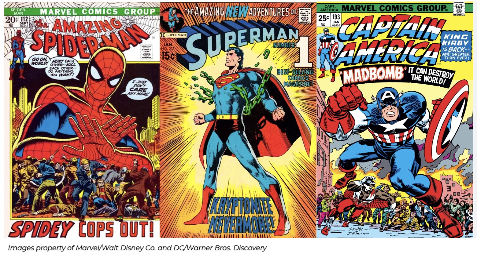
I liked the stories and characters, but most of all, I loved the covers and their bold artwork and typography. Every hero not only has a name, but their own dynamic and dimensional logo! There’s usually a headline and subhead laid out with powerful type treatments. It’s all skillfully designed together with the cover art to create imagery and messaging that literally pops off the page. Every cover is a “promo” for the book itself, a marketing tool, depicting an over-the-top version of the actual plot within. And much like some TV promos or movie trailers, the cover is often better than the rest of the comic itself.
Fast forward decades into my adulthood – I bought three poster-sized stretched canvas replicas of classic ‘70s comic covers and hung them in the new TV room. And one day while gazing at them, it hit me…POW! Look at those logos! BAM! Look at that typography! BOOM! Look at that artwork! This must be my inspiration! There has to be a connection!
For the first half of my career, I worked in broadcast promotion, making TV promos that were often better than the shows themselves. And for my entire career, I’ve been obsessed with typography and how to make text pop off the screen. Sound familiar?
The power of the art and style of superhero comics from my childhood has always energized me, and now, apparently, inspired me as well. With great power comes great responsibility – the responsibility to use my design powers for good and not for evil. Just thinking about it gets my Spidey Sense tingling…how about yours?
Deep thoughts by Jonathan Markella
Images property of Marvel/Walt Disney Co. and DC/Warner Bros. Discovery
Everything I know I learned in 4th grade. From Spider-Man. And Captain America, Batman, Iron Man, Superman, Green Lantern and the Hulk. Let me explain. I’m a creative director and I’ve been “directing creative” in one form or another for almost 40 years (not a misprint). And while I am not a designer and have had no design training, I have a love for directing design, with a specific focus on typography and logos. Over the years people have asked me where this comes from, and for most of my career, I didn’t have an answer. Like many things in life, it was just always…there. One of the few benefits of age (emphasis on few) are the occasional moments of clarity that allow you to connect a few dots and identify patterns in what always seemed like a long life of lucky breaks and random occurrences. And one such moment of clarity hit me a few years ago.
I was an avid comic book collector as a kid. Not just a reader, but an invested collector – appreciating the comics that appreciated in value, learning who buys them, how to save them and when to sell them. But most importantly, I just loved the comics themselves. You’d be surprised at how well some of them were written, often sending me scurrying for a dictionary or an adult.
“Hey Dad, what does Armageddon mean?”
I liked the stories and characters, but most of all, I loved the covers and their bold artwork and typography. Every hero not only has a name, but their own dynamic and dimensional logo! There’s usually a headline and subhead laid out with powerful type treatments. It’s all skillfully designed together with the cover art to create imagery and messaging that literally pops off the page. Every cover is a “promo” for the book itself, a marketing tool, depicting an over-the-top version of the actual plot within. And much like some TV promos or movie trailers, the cover is often better than the rest of the comic itself.
Fast forward decades into my adulthood – I bought three poster-sized stretched canvas replicas of classic ‘70s comic covers and hung them in the new TV room. And one day while gazing at them, it hit me…POW! Look at those logos! BAM! Look at that typography! BOOM! Look at that artwork! This must be my inspiration! There has to be a connection!
For the first half of my career, I worked in broadcast promotion, making TV promos that were often better than the shows themselves. And for my entire career, I’ve been obsessed with typography and how to make text pop off the screen. Sound familiar?
The power of the art and style of superhero comics from my childhood has always energized me, and now, apparently, inspired me as well. With great power comes great responsibility – the responsibility to use my design powers for good and not for evil. Just thinking about it gets my Spidey Sense tingling…how about yours?
Deep thoughts by Jonathan Markella
Images property of Marvel/Walt Disney Co. and DC/Warner Bros. Discovery