04.12.16
Making Text in 3D Space Look Real!

We’ve all gone to the movies and seen unique opening movie credits that use large 3D text floating in actual environments and landscapes. The text is clearly not “real” but it looks natural in that space. And that’s the “trick”. What makes it look so real?
MK3 recently created a video for an insurance company. They needed an internal video to convey survey results…pretty mundane stuff – but important information for their employees. Our challenge was to make text-based information and statistics visually interesting. Our solution? Movie credits!

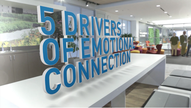
We shot high resolution video of the open and spacious insurance office and used them as background “plates” or graphic environments. We then brought the text and stats to life by creating them in 3D and placing them in the 3D environments, using Cinema 4D software. The statistics now looked like they were floating down hallways, bar graphs were animating in the lobby, and images floated in dramatic stairwells. But placing them there was only the first step. How did we make them look real and belonged in that space? Here are 6 tips to make it real, and get it right…
- Proportionally Correct: Make sure the size and shape of the objects seem relative to the background plate, or environment in which they are placed.
- Perspective Match: The parallel lines of the objects need to converge in order to give the illusion of depth and distance.
- Realistic Shadows: Make sure the placed objects cast shadows that match the ones in the background; in distance as well as texture (softness or hardness).
- Accurate Lighting: Study the background lighting and match it – direction, color temperature & texture (soft/hard).
- Match Lens Look: For our project, we used a wide angle lens to shoot the backgrounds (see photos – note how the table bends). Give the text and objects the same lens perspective so that they match (note how the letters bend as the table image does).
- Camera Moves: If the camera moves on or in the background, make sure the camera moves with the text – and the moves match. We used PFTrack software to match moves.
Adam Marx is a Director/Senior Producer and Partner at MK3 Creative. To learn more about Adam and MK3 visit https://www.mk3creative.com/.

We’ve all gone to the movies and seen unique opening movie credits that use large 3D text floating in actual environments and landscapes. The text is clearly not “real” but it looks natural in that space. And that’s the “trick”. What makes it look so real?
MK3 recently created a video for an insurance company. They needed an internal video to convey survey results…pretty mundane stuff – but important information for their employees. Our challenge was to make text-based information and statistics visually interesting. Our solution? Movie credits!

We shot high resolution video of the open and spacious insurance office and used them as background “plates” or graphic environments. We then brought the text and stats to life by creating them in 3D and placing them in the 3D environments, using Cinema 4D software. The statistics now looked like they were floating down hallways, bar graphs were animating in the lobby, and images floated in dramatic stairwells. But placing them there was only the first step. How did we make them look real and belonged in that space? Here are 6 tips to make it real, and get it right…
- Proportionally Correct: Make sure the size and shape of the objects seem relative to the background plate, or environment in which they are placed.
- Perspective Match: The parallel lines of the objects need to converge in order to give the illusion of depth and distance.
- Realistic Shadows: Make sure the placed objects cast shadows that match the ones in the background; in distance as well as texture (softness or hardness).
- Accurate Lighting: Study the background lighting and match it – direction, color temperature & texture (soft/hard).
- Match Lens Look: For our project, we used a wide angle lens to shoot the backgrounds (see photos – note how the table bends). Give the text and objects the same lens perspective so that they match (note how the letters bend as the table image does).
- Camera Moves: If the camera moves on or in the background, make sure the camera moves with the text – and the moves match. We used PFTrack software to match moves.
Adam Marx is a Director/Senior Producer and Partner at MK3 Creative. To learn more about Adam and MK3 visit https://www.mk3creative.com/.